 Atlas login
At Kontur, our expertise is in geospatial solutions for disaster management. These solutions include the development of web apps, such as Disaster Ninja, used by humanitarian mappers to support emergency response teams. As our platform expanded over time, we needed a flexible system where all interface elements would be:
- In harmony with one another and support consistent design;
- Understandable for the user at any point of interacting with the applications;
- Reusable directly without the need to build the components from scratch so that we could save time, money, and energy for other development and design work;
- Easy to change without affecting how the applications work, thus separating their business logic from presentation logic and making it possible to customize them to meet different stakeholder needs.
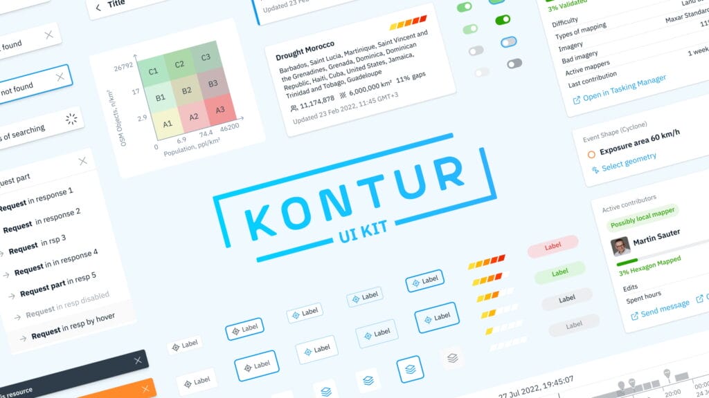
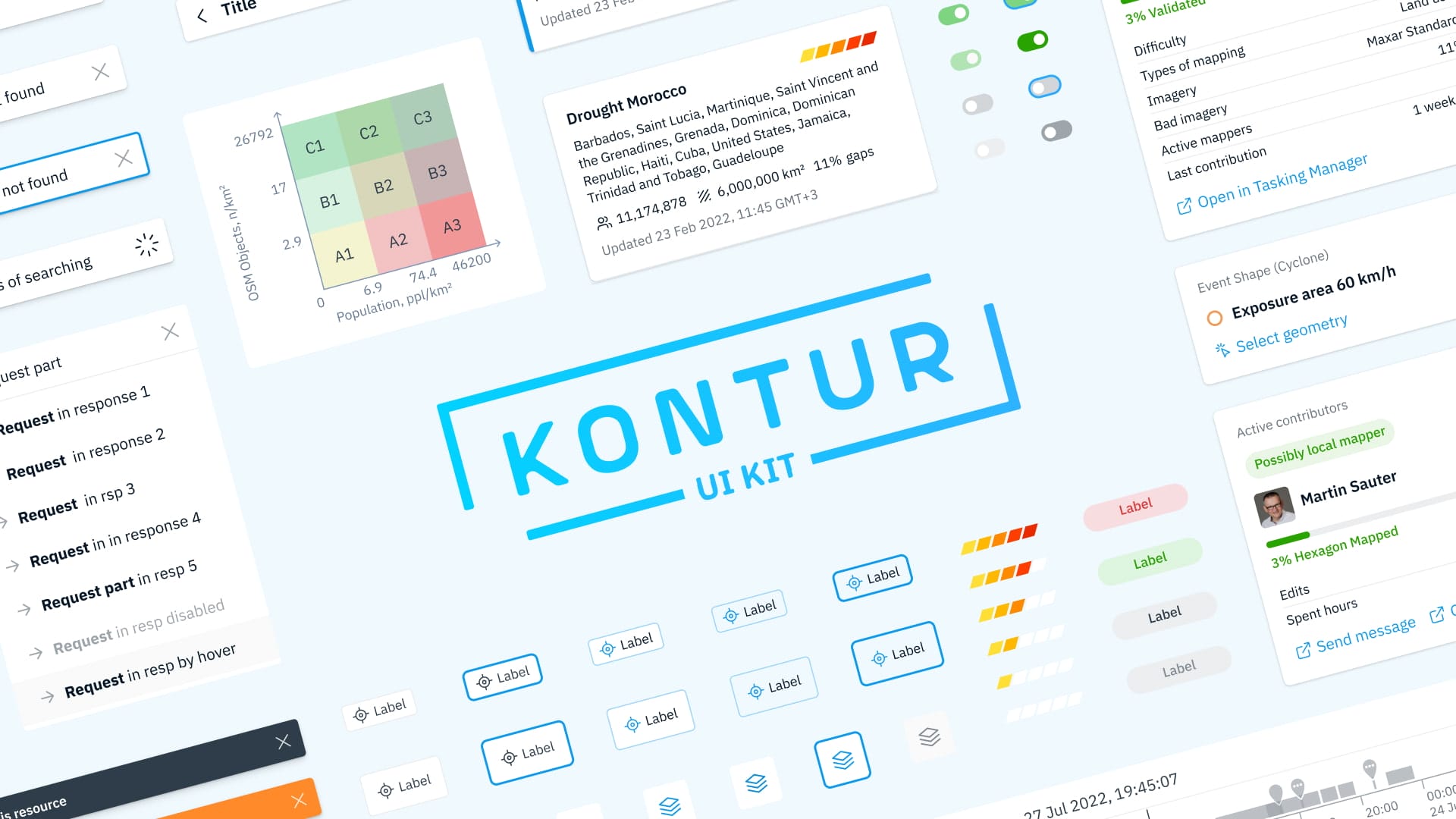
Kontur UI Kit
A solution to these challenges came from a user interface (UI) kit – a collection of premade interface elements for a website or app development. Nowadays, we develop features for Kontur Platform based on Kontur UI Kit, open-sourced on Figma and GitHub, and we find it helpful in supporting geospatial systems overall. It is a React component library, and we used the isolated-component environment React Cosmos to showcase it. You can find the free kit and start using it for your projects here: Kontur Design system on Figma and Frontend library on GitHub.
There are numerous UI kits available to designers of websites and applications. Here are some of the reasons for choosing the Kontur UI Kit:
– It addresses geospatial requirements. We are applying the kit’s elements to the map layout in our Disaster Ninja application. Using simple components, we can construct more complex features on the map, such as panels with analytical layers, toolbars, and popups.
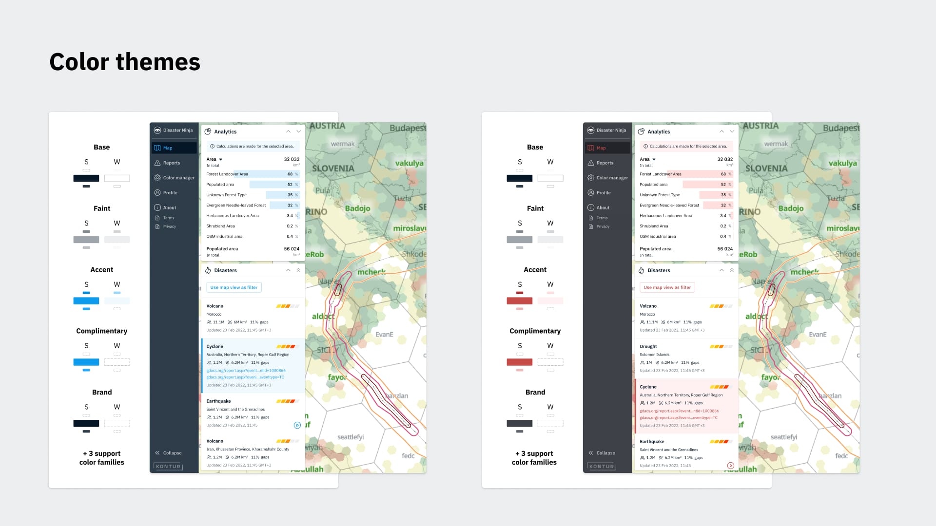
– Theme support makes it flexible for customization. We provide the Kontur Platform as a set of modules for our partners and customers, and we make its installation customizable from the UI point of view to align it with these organizations’ brand books. You can apply a new “user theme,” including elements like a color palette and logo, and still have a consistent map viewer application.
– We actively develop and maintain it. The Kontur team of front-end developers constantly supports our public repository, with hundreds of commits contributed over the past year.
– It is lightweight and is capable of “tree shaking.” From a user perspective, a good UI kit should minimize the webpage size by allowing the desired features and excluding those not used. Tree shaking is an optimization method for reducing the resulting size of the webpage.
– It is open-source under the MIT license and free for private and commercial use.
What’s inside the kit?
Let’s briefly examine some of the main components of Kontur UI Kit.
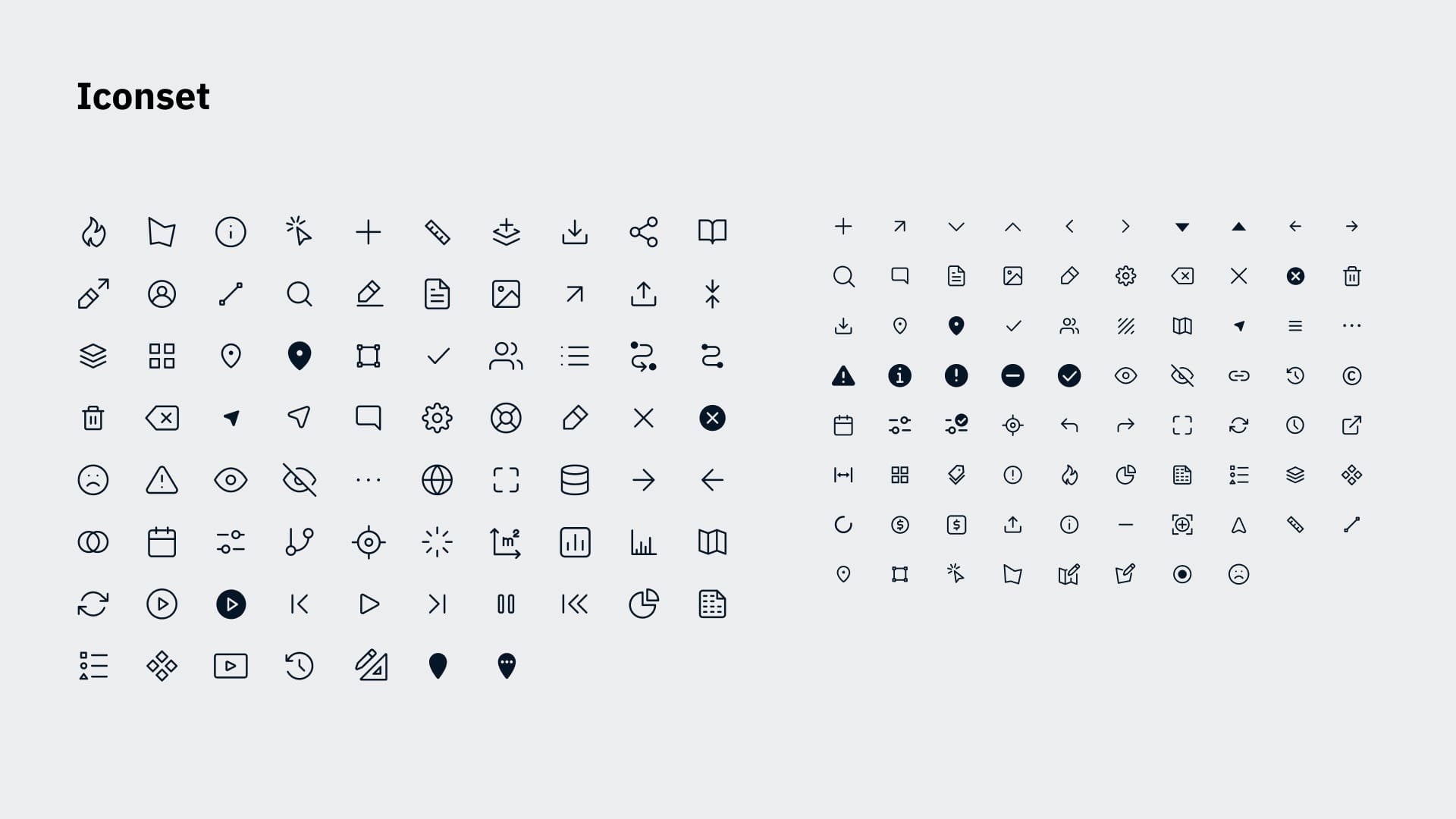
Themes and icons
Separately from the actual UI Kit in the navigation menu, you will find the default icon set and the default theme represented by the color scheme. We design icons in Figma, including many specific to geospatial tools and disaster management, such as a map, a polygon, or a fire. All elements in the kit depend on the color palette, so you can change their appearance by switching color variables if you want to apply a different theme across the application.
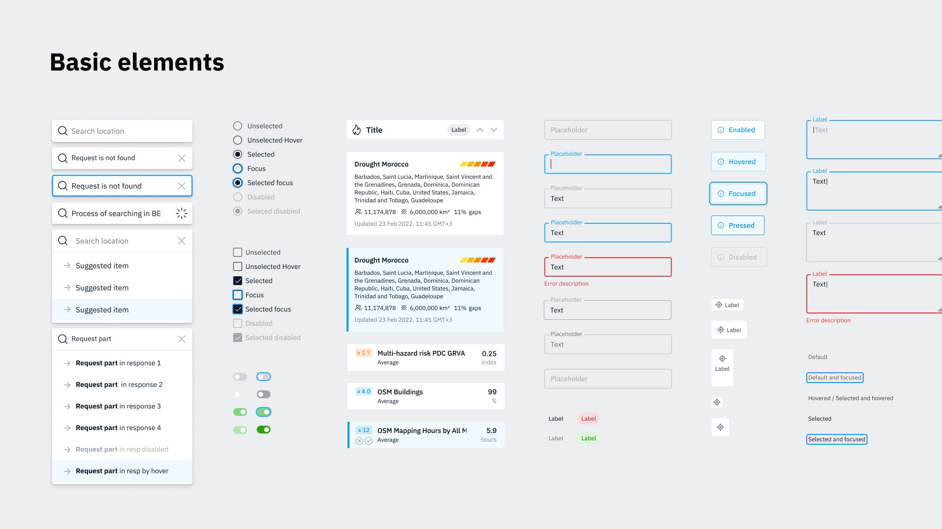
Basic components
The UI kit supports a variety of essential elements, such as inputs, selects, buttons, tabs, checkboxes, radio buttons, and many more.
Components for map applications
Here are some of the elements that are well-suited for the interface of geospatial applications:
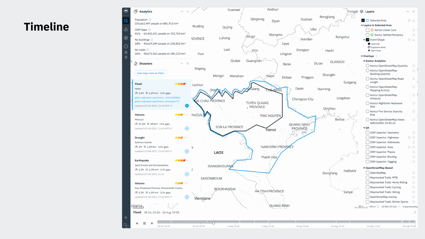
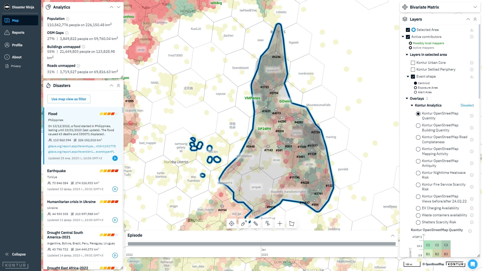
- Timeline: its purpose is to enable the users of our disaster management platform to follow the progress of hazard events over time and multiple episodes.
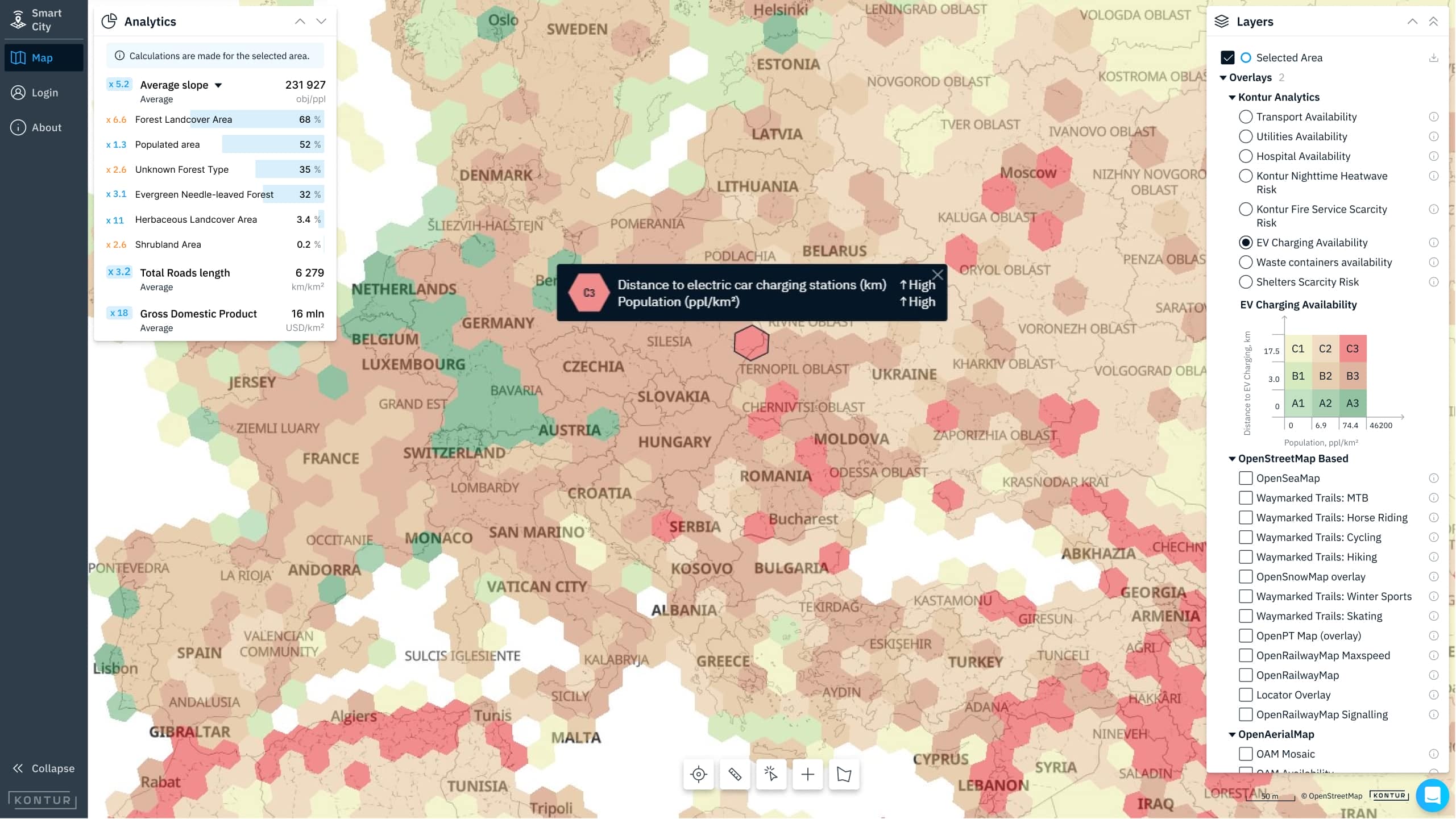
- Legend: it currently contains our specific bivariate matrix used in the Disaster Ninja interface to represent the relationship between two indicators with a color range. We also plan to supplement it with a standard univariate legend.
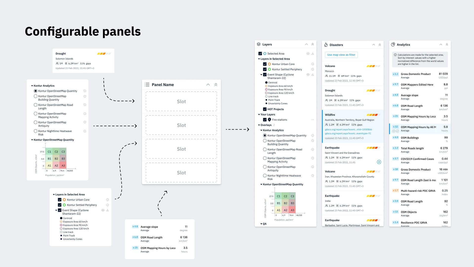
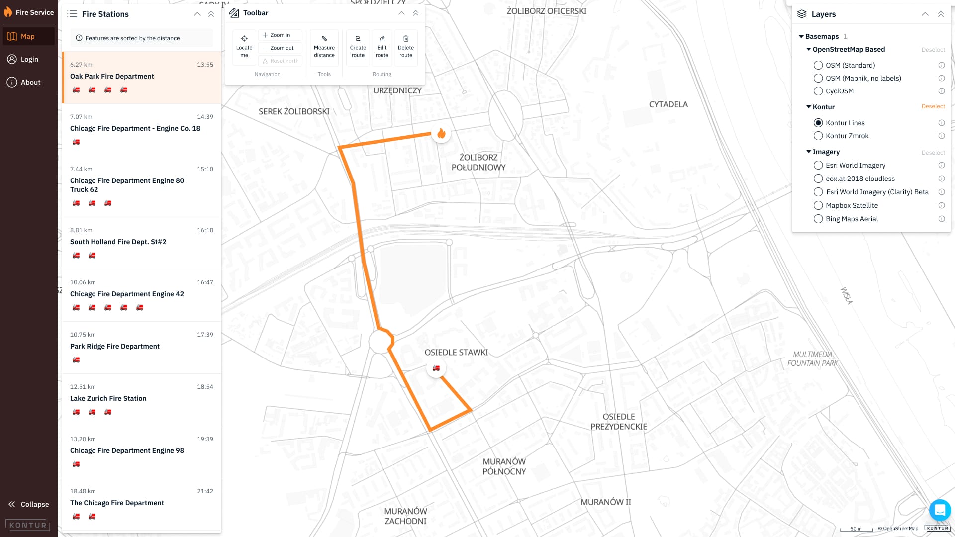
- Panel: a configurable frame containing various other components that can expand/fold between different states. There are panels for the lists of layers, disaster events, and analytics summaries on Disaster Ninja.
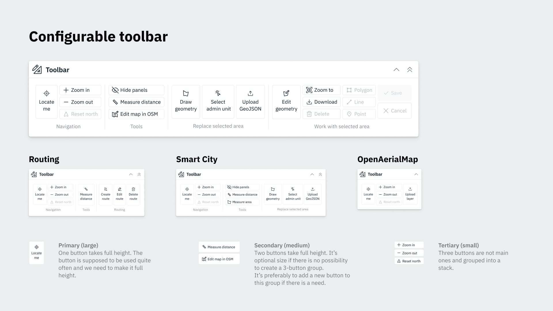
- Toolbar: currently in development, it is an adjustable bar containing all the individual tools available for the map user to navigate, work with the selected area or perform other actions.
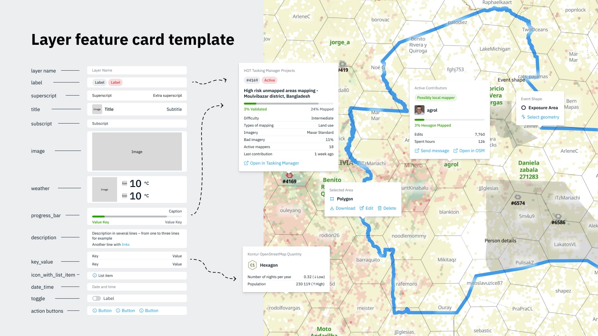
- Kontur’s designers are also working on popups, layer feature cards, progress bars, and other elements for the upcoming versions of Disaster Ninja. The UI kit will expand with new components as we release them in the app.
Cases of Kontur UI Kit usage in geospatial applications
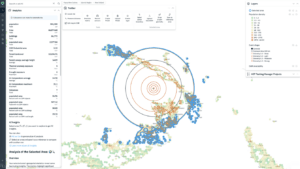
As mentioned above, we apply Kontur UI Kit in Disaster Ninja to ensure user interface consistency. Recently, we have expanded the application with the new Smart City mode combining tools relevant to urban development, such as EV charger and waste bin availability layers. Kontur UI Kit was a natural choice for the interface of this mode, as is the case with the Fire Service Routing application that we are upgrading based on the Dispatcher 112 app.
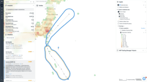
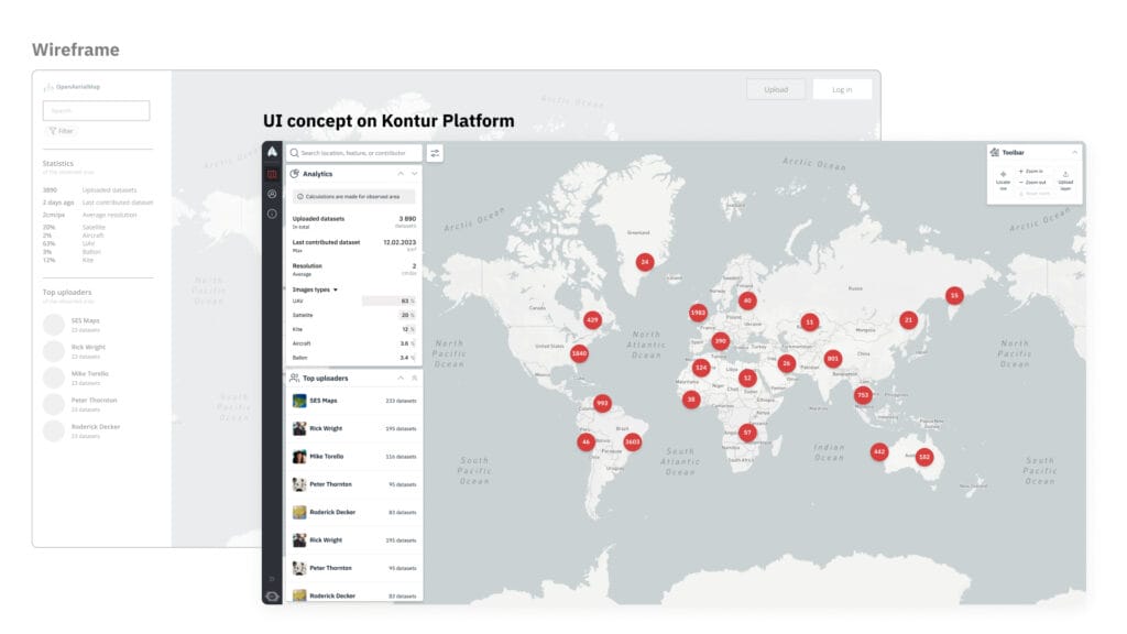
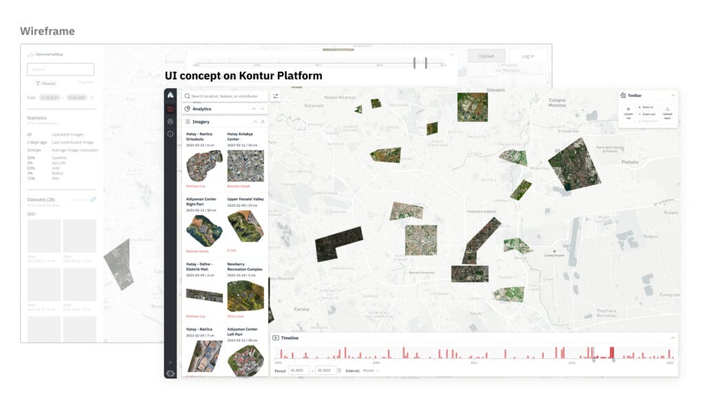
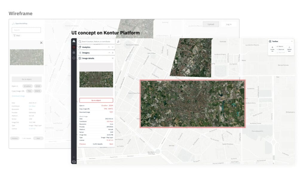
In the past year, we have worked on the redesign guidance for the geospatial platform used by the OpenAerialMap (OAM) community. As a result, we developed and presented prototypes of the application’s new version. Even though the project focused on solving current problems rather than final implementation issues, we quickly realized that Kontur UI Kit would be well-suited to the app’s interface development, as shown by the kit elements on the prototypes below.
A UI kit is an invaluable tool for designers and front-end developers, making their workflow faster and more straightforward. The lightweight and flexible Kontur UI Kit is a good choice for geospatial applications, and our team can help other organizations customize it to suit their style guide. The kit is free – try it out here:
– Kontur Design system on Figma,