Atlas login
by Andrey Sekste and Misha Malikin
What happens if you ask hundreds of people worldwide to visualize your data with any tools or technologies available?
In the humanitarian sphere, having reliable population data is crucial for prioritizing life-saving activities. Yet, detailed and free population data on a global scale is challenging to find. The Kontur Population dataset is one of the most popular sources in the UN’s Humanitarian Data Exchange (HDX) and is part of Kontur’s critical event management solution, Disaster Ninja.
While it may be known to humanitarians, we were curious to see how a wider community of mappers less familiar with our data would experience using Kontur Population. This blog post is about what we have learned through their maps and from their feedback.
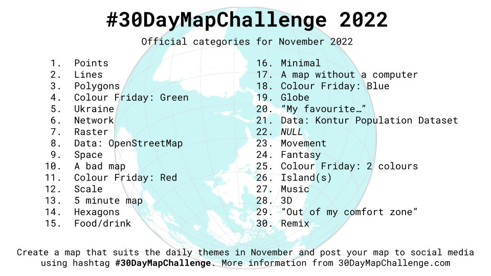
About #30DayMapChallenge
Every November, the Kontur team and hundreds of other mapping enthusiasts worldwide participate in the social mapping project #30DayMapChallenge by creating maps for 30 consecutive days. Each day of November has an official theme to be reflected in the map submitted on that day, and this year the Kontur Population dataset has become one of the daily themes. More than 150 individuals and organizations have created maps using our population dataset and posted them on Twitter.
What is Kontur Population?
We are obtaining, processing, and correcting data from multiple sources to build Kontur Population, a global dataset with population counts in 400-meter H3 hexagons. Initially, we developed the dataset as part of our Disaster Ninja project to help humanitarian organizations take confident action based on various data correlated with population density. Read more about the sources we use and the measures we take to improve the accuracy of the Kontur Population dataset.
The maps with Kontur Population
When evaluating the quality of maps submitted for #30DayMapChallenge, it is worth noting that they result from voluntary effort and, with a daily publishing frequency, typically have little preparation time. Still, looking through all the maps where the challenge participants have used our dataset, we were impressed by their variety, visual attractiveness, the creativity applied to their creation, and the deeper insights they bring.
Below, we want to share a few maps that address topics of particular significance to us at Kontur as a humanitarian mapping solutions provider. The themes include climate change, flood risk, water security, access to emergency services, and general population distribution.
Climate Change: Who will feel the impact of thawing permafrost first-hand?
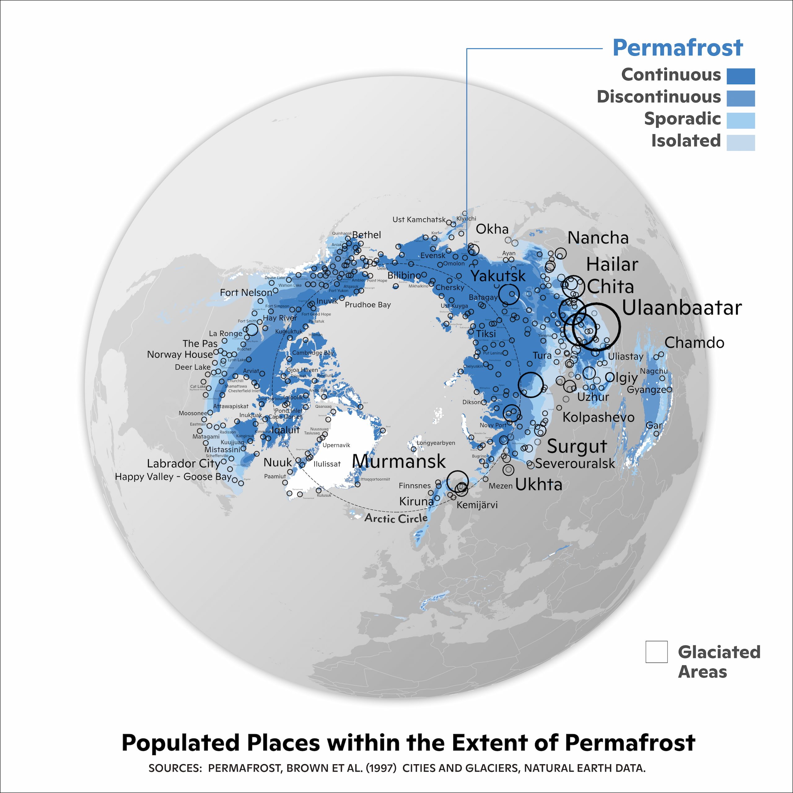
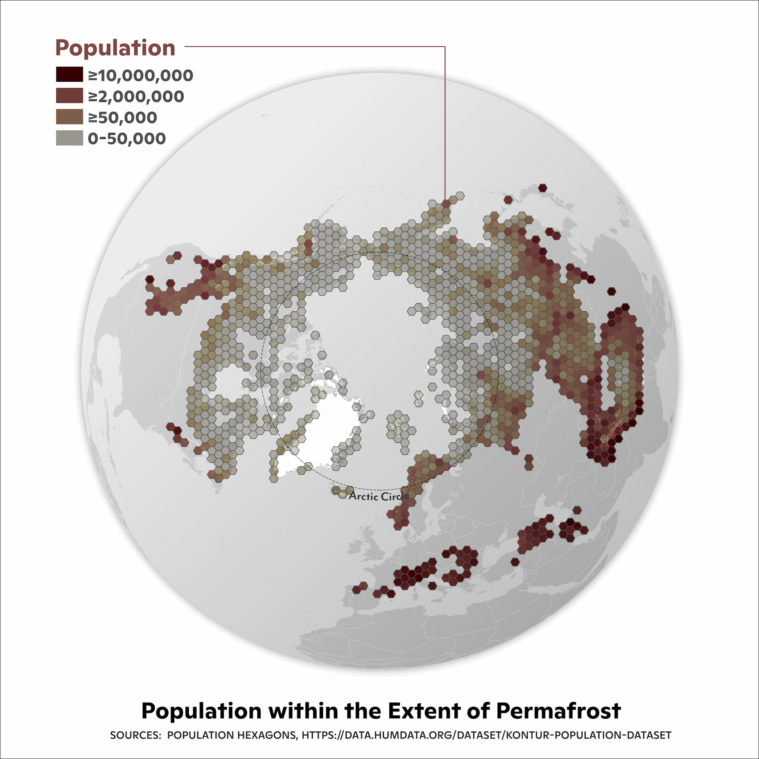
Map source: https://twitter.com/WoodwellClimate/status/1594738000054943750
Our first featured map comes from Greg Fiske, a cartographer and analyst at the Woodwell Climate Research Center, and their Permafrost Pathways Team. The map creators describe it this way:
“The Arctic is home to more than four million people. Folks in this region are seeing the impacts of climate change at a more rapid and pronounced rate than lower latitudes—in some cases having the ground they live on erode out from underneath them.“
As we learned from the Permafrost Pathways Team, having reliable and up-to-date population data is critical to their research in the circumpolar Arctic. A big part of the Arctic residents represented on this map are Indigenous and have been the original stewards of the land and water since time immemorial. In recent decades, they have witnessed dangerous environmental changes in some areas, including permafrost thaw, flooding, and erosion.
Population data and maps used for the climate adaptation and resilience work can support Arctic residents in their efforts to protect their communities and traditional lifeways from such detrimental impacts of Arctic climate change.
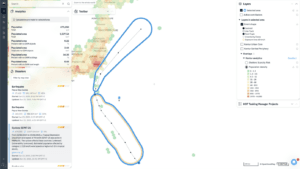
Flood Risk: Who is vulnerable to flooding in this Florida county?
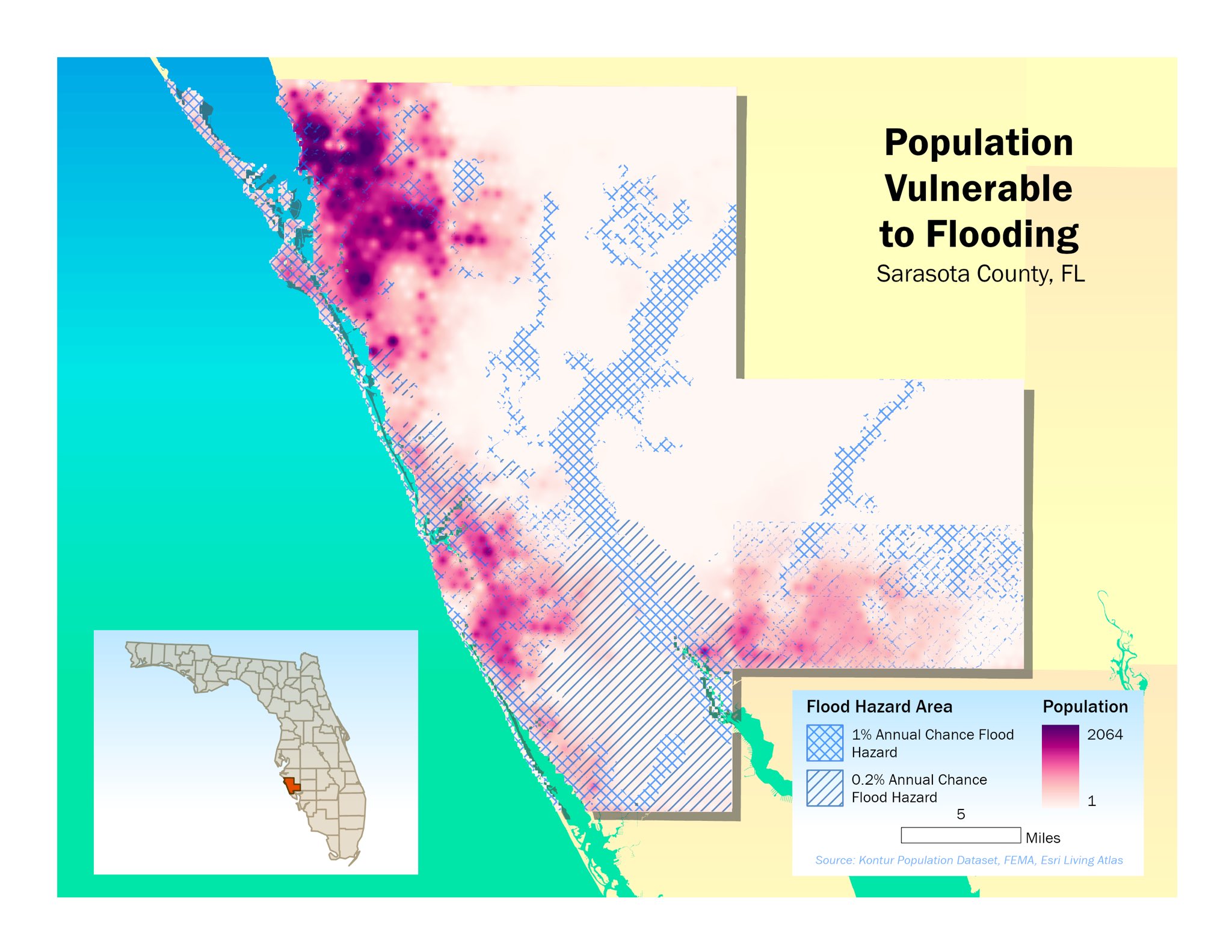
Map source: https://twitter.com/joshspatial/status/1594874837650051073
Closely related to climate change, the increasing flood risk is where its impact is most apparent. Along with wildfires, floods are the most widespread type of natural disaster on our planet, and there are few places where people are not vulnerable to them. While floods have fewer casualties than earthquakes or storms, they have the highest annual average number of people affected compared to other disaster types – 83 million, according to United Nations Office for Disaster Risk Reduction data.
Josh Marcinik used the Kontur Population dataset to create the map above. It overlays US Federal Emergency Management Agency’s flood hazard area over our data to visualize population vulnerability to flooding events in Sarasota County, Florida. Reliable population data is vital in accurately analyzing flood hazard areas. As Josh explains:
“Datasets aggregated to larger areas can give a false impression about which populations are vulnerable (or not) and having a dataset like Kontur is a valuable tool in understanding risk.“
Water Security: Who depends on the Mississippi river for their well-being?
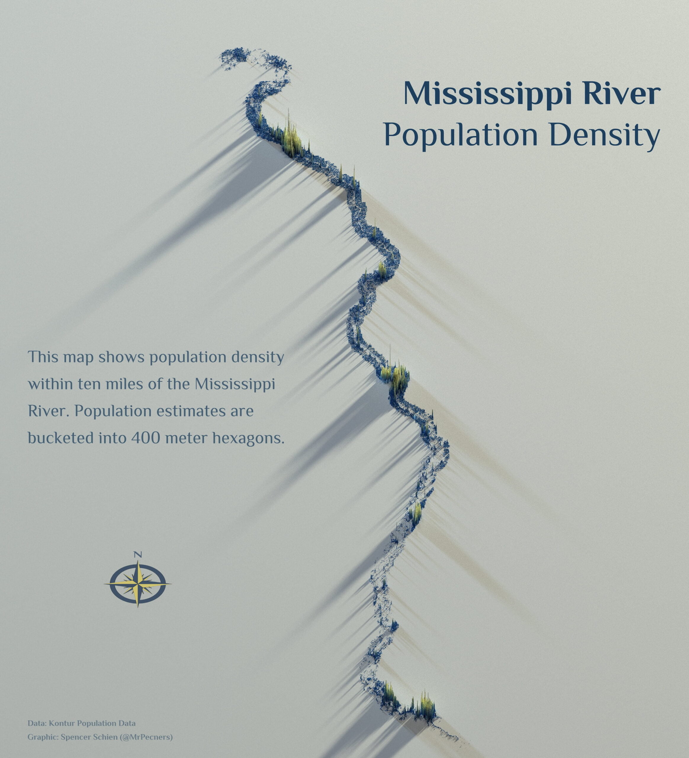
Map source: https://twitter.com/MrPecners/status/1596260190374227970
Major rivers are usually of great importance to national economies and especially to the security of the population residing in their proximity. A society achieves a high level of water security when it can make the most of its water resources and limit the risk associated with water scarcity (droughts), poor quality, or excessive amounts (the flood risk discussed above).
Several participants in the challenge have decided to create maps of the population living within a few dozen kilometers of rivers or freshwater bodies. One of them is Spencer Schien, whose visualization above limits the Kontur Population data to ten miles on either side of the Mississippi River.
Once again, the reliability and accuracy of population data are crucial to strengthening the impact of such maps through relevant insights. With the level of detail that 400-meter hexagons provide, a map viewer can easily zoom in on familiar places and draw appropriate conclusions.
“With reliable data, the conversation and impact are elevated to where meaningful insights can be reached.“
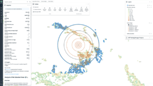
Health Service Accessibility: Who lives further than 10 miles away from a hospital?
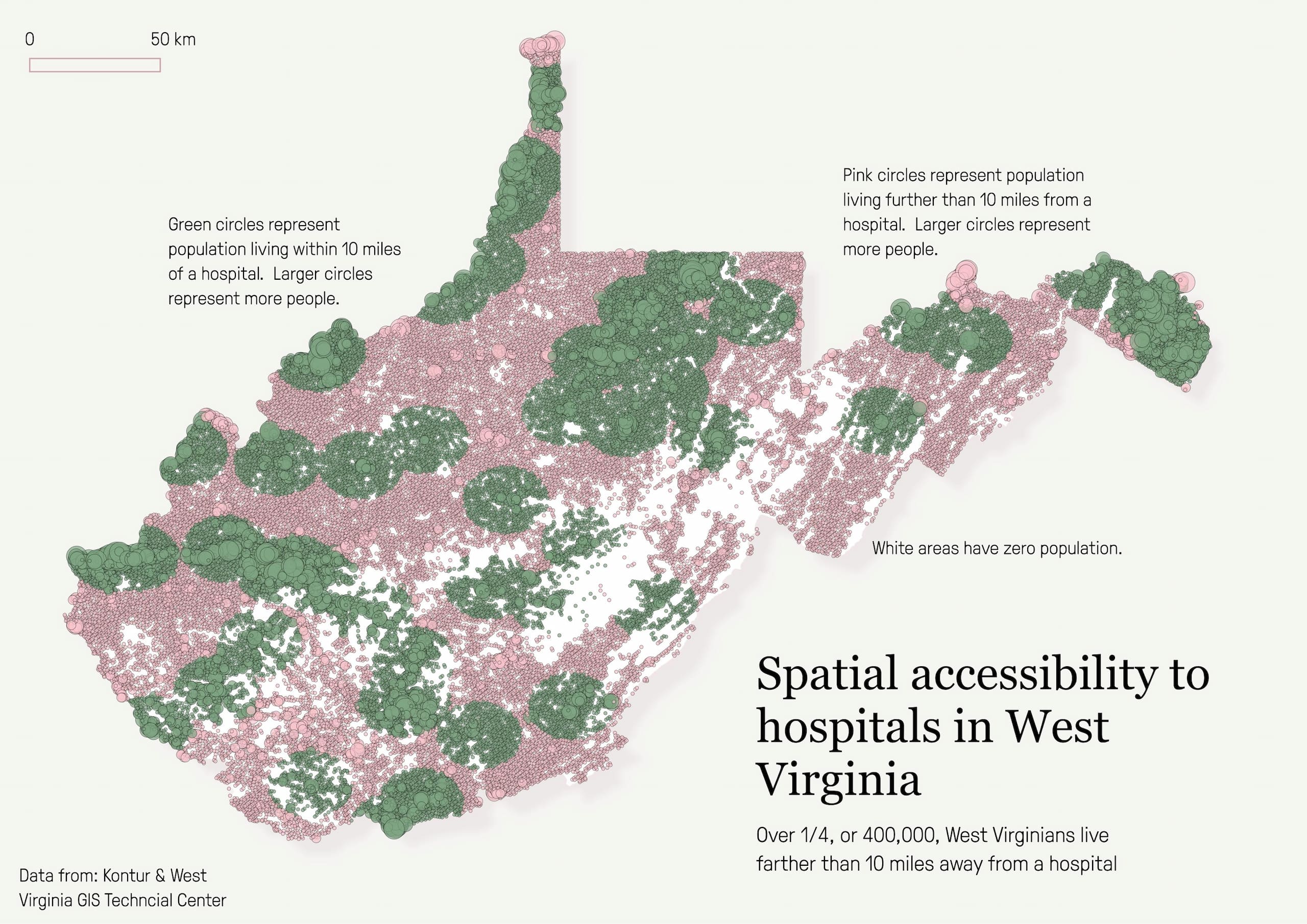
Map source: https://twitter.com/aliciaoberhol/status/1595961134938755072
At Kontur, one of our areas of expertise is creating global maps of critical service availability in populated areas, such as our Fire Service Scarcity Risk map. These maps can help municipal authorities and urban planners optimize the coverage of various city services.
It was our pleasure to see that Alicia Oberholzer had picked up a similar idea for her challenge submission. Her map below shows the population in West Virginia living within a 10-mile distance from a hospital, where the larger circles correspond to a higher population. In the Twitter post, Alicia describes what motivated her to create the map:
“This map was inspired by my time living in WV with health issues. I had to go to the ER once and it took over a 30-minute drive to get there, which got me interested in emergency health service accessibility in rural America.”
While the map aims to highlight the lack of spatial accessibility to hospitals in rural West Virginia, Alicia admits that the problem exists for much of the rural United States. Similarly to the other featured map authors, she highlighted the importance of having reliable population data for accurately estimating the magnitude of socioeconomic and environmental challenges. The data can also help quantify the impact that alleviating these challenges would have.
Population distribution: Where do Canadians live?
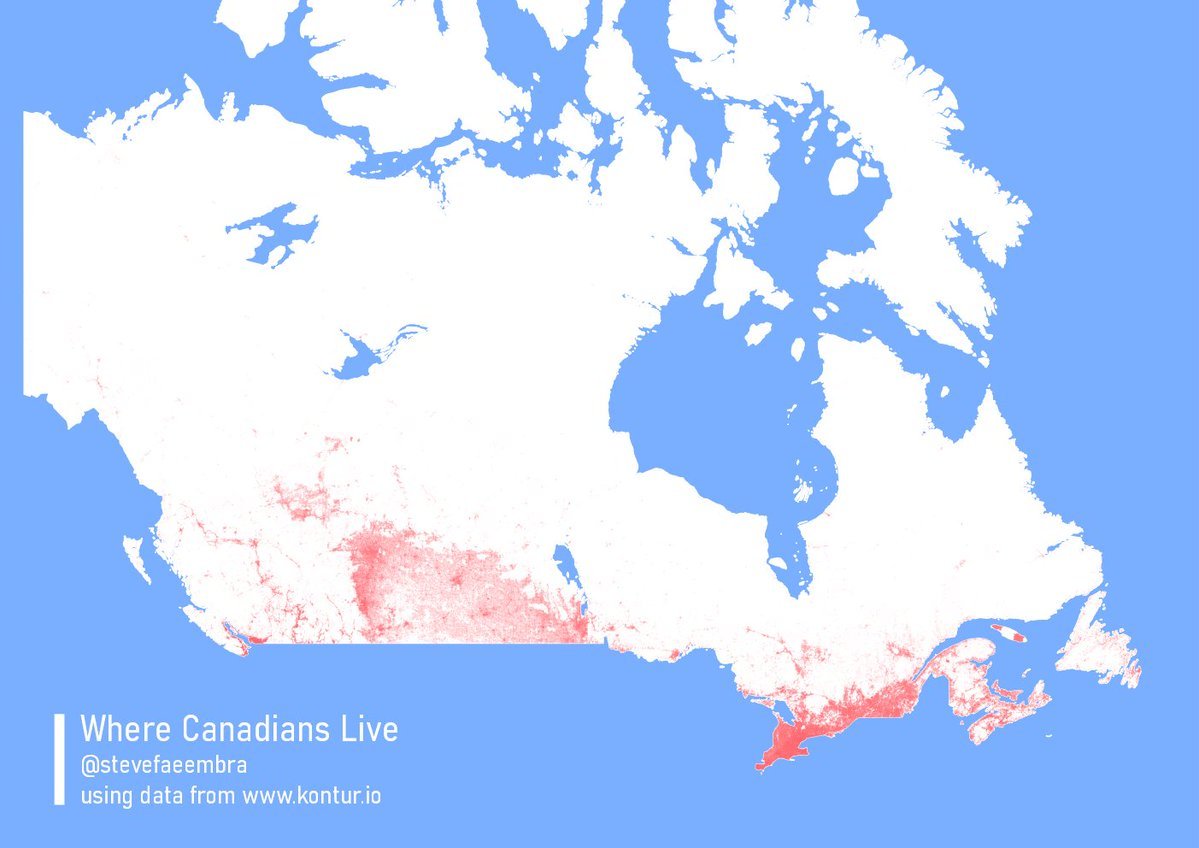
Map source: https://twitter.com/stevefaeembra/status/1594767532069687298
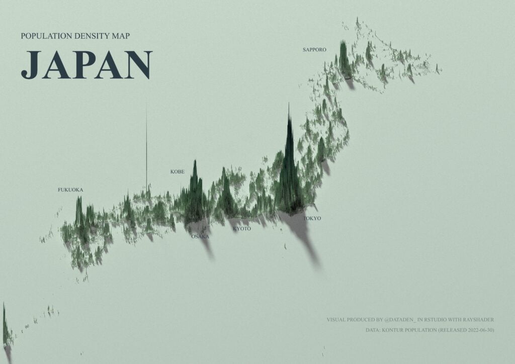
Our final featured map is devoted to the peculiarities of in-country population density distribution. Many participants of the challenge have picked country subsets of the global Kontur Population dataset to visualize densely populated areas. While a map like that may not address social or environmental issues directly, knowing where people live within a country or region is critical to disaster response teams and public service planners.
Sometimes, the way the population spreads out can be surprising, such as on this map of Canada provided by Steven Kay. It’s a reminder not to confuse a nation’s territory with the boundaries of population distribution and to avoid making wrong assumptions. While some think of Canadians as true Northerners, most Canadians live farther south than citizens of many European countries:
“Fun fact, here in Scotland, I live further north than 99% of Canadians.“
What mappers say about Kontur Population
Through comments on Twitter over the challenge month and in a dedicated survey conducted shortly after, we have received many remarks on the usability and quality of the Kontur Population dataset. Here is a glimpse of the feedback and what we learned from it.
The data is ready and easy to use.
The survey respondents found that using Kontur Population is more straightforward than other data sources. The dataset is ready-to-use and doesn’t require identifying correct variables or cleaning the data. Also, it is already available as part of other mapping products, such as Foursquare Studio.
“The ease of use and worldwide coverage – at an impressive level of detail.”
Survey respondent
The global dataset is heavy, but per-country subsets are available.
While the respondents haven’t reported significant difficulties using the data, the size of the global dataset had created issues with load time for some users due to insufficient memory or lower broadband speed. Considering the extent of the global data, it is unsurprising that the original file is of a considerable size, even in a compressed form. Individual country-level datasets of a smaller size are also available on HDX and are often sufficient for the mappers’ needs.
The data granularity makes deriving deeper insights possible.
When asked what they liked about Kontur Population the most, respondents stressed the level of detail and granularity in the data. The map creators considered the 400-meter tiling at H3 resolution 8 to be a significant improvement compared to highly aggregated population datasets.
“It’s both simplified and detailed, which creates a lot of possibilities.“
Survey respondent
Finally, we have received several suggestions on further Kontur Population improvements. Among these are providing a way to query the entire dataset for a custom subset of the data, such as a group of countries or individual cities, and uploading it into Google’s Earth Engine Data Catalog. It was a great pleasure to see the active involvement of survey respondents and other participants of 30DayMapChallenge in feedback and recommendations on our dataset.
Conclusion
As the number of dataset downloads and views at HDX spiked in November, 30DayMapChallenge has become a test of Kontur Population data usability and reliability. We are happy that the data proved applicable for visualization and insight extraction in many domains, such as those mentioned in this post. We are also grateful to the mappers who have taken the time to comment on the dataset so we can use this input for future improvement.
If you haven’t done so, you are welcome to download Kontur Population at HDX and use it for your map creation or any other purpose. Should you need some custom processing or higher-resolution data, please don’t hesitate to contact us at hello@kontur.io.